FEEDBACK
Newspaper Assignment Feedback
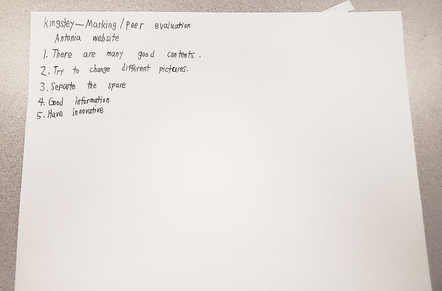
Article Website Feedback
ENGLISH FEEDBACK (from Angela Liu and Esther Leung)
-
the colours can be adjusted to fit the scheme better
-
like the design
-
like the writing and paragraphs
-
like the organization and colours (not too flashy nor boring)
-
a bit too word-based
-
maybe add pictures in between paragraphs to make reading easier
-
-
it could relate to English a little more
-
create a top art
FRENCH FEEDBACK (from Tyrus Chan)
-
The main heading text is a bit difficult to read
-
The animation is a bit too fast on the video link parts
-
I think its good
French Subject Page Evaluation Presentation
From Carina Huang
-
the colours look super nice and consistent
-
pictures are clear and fit the topic
-
a few of the icons can be sharper, but they still match the vibe
-
clean, well organized, lots of space (doesn't look messy)
-
fonts could use bigger size but are clean and stylish
-
pictures and text match
-
simple and clear title (know what page is about)
-
strongly relevant to French and covers everything
-
style: looks very clean and pretty good
-
small problem when the subject page is clicked (rickroll)
French Webpage Feedback


Math Subject Page Evaluation Presentation
From Ben Tran
-
Colours: Harmonious, consistent, contrast and aligns well
-
Images are high quality, consistent, has pop-up and alt test
-
Some not really supporting the main point
-
-
Graphics similar to images
-
Balanced graphic distribution and ample whitespace
-
clear visual hierarchy
-
visible complementary font
-
highly readable
-
consistent font usage
-
-
Clear, highlighted CTAs
-
Consistent tone
-
Decent scannability
-
Informal tone
-
Missing bullet points but not necessary
-
Excellent contrast
-
Decent flow
-
Title: clear, relevant, reflect central idea and theme
-
Excellet content, but adequate importance
-
missing thesis statement
-
-
Clear explanation and definition, subject application
-
Outline specific knowledge and skills gained
-
Relevant trends and cases
-
Main points summarized
-
Main points reinforced
-
Missing future outlook
-
Highly engaging
-
clear language
-
tone is too informal
-
good flow and transition
-
missing citation
Improvements
- Improve images' relevancy through writing articles revolving around images or use images relevant to articles
- Formal wording: avoid usage of 1st and 2nd person pronouns and pause within articles, avoid wordiness while incorporate fancy terms
- Incorporating bullet points
- Place images on left for a clearer flow